
The
intricacy of the design (and the amount of work involved in making it)
astounded me. That photograph of that
quilt haunted my thoughts for a long time!
I had to make my own interpretation of it. The book included a small paragraph on how
the unknown maker achieved her masterpiece.
I could not make head nor tail of the explanation! Only more recently have I worked it out.
The
maker apparently drew a full scale drawing of her design on paper, including
registration marks where pieces fitted together. She then cut around every piece, every petal
and leaf, every frame and scroll and hand basted fabric over every pattern
piece of paper. She then whip stitched
every piece together. Some leaves are
completely inset within the background fabric.
Now
isn’t that the most extraordinary achievement in English paper piecing you have
every heard of?
This
quilt has been the subject of an article in The Journal of the British Quilt
Study Group, Issue 10, 2009. The article
by Bridget Long called “Sibling, Cousin or Friend?” compares the coverlet that
I loved from the British Quilt Heritage Project with another very similar
fragmentary coverlet now in a private collection in the United Kingdom
I
decided I needed to make a quilt with a similar style to the beautiful coverlet
I had seen in the book. This quilt
became “Pemberley”, probably my favourite of all the quilts I have made so far
and the one which has given me the most enjoyment teaching.
All
of the quilts I had made up to this time to teach were my own original
designs. I was not sure whether my
students would want to make a quilt based on an antique but I was making it
just for me. I drew up a design to scale
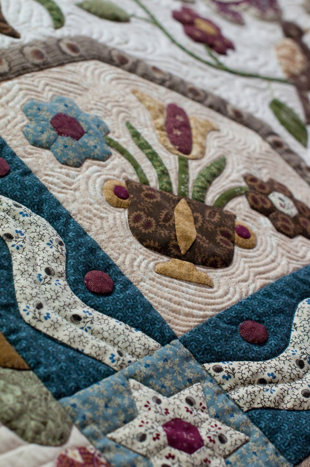
on paper and commenced appliquing the centre medallion. The original coverlet included a small
rectangular basket on a mat and the major flower in the centre of the quilt was
a giant sunflower. I refined the urn and
drew my own flowers based on the shapes used elsewhere in the quilt. I appliquéd a row of scallops around the
central oval which was outlined by a small “peeper”. I also drew a rambling vine of flowers around
the centre. I made these symmetrical for
the “asymmetrically challenged” and they form a larger curved shape around the
centre.
I
made the appliquéd “wavy” border and intended to stop there and make the quilt
into a wall hanging. My friend, Deborah
Louie, always one to encourage me and spur me on to even more work, convinced
me to keep going with the outside blocks.
She
is also responsible for the idea of adding 68 tiny circles in between the
curves of the wavy border – thank you Deborah!
The
original coverlet included three different appliquéd block designs in the
outside border, surrounded by a complex arrangement of clam shells. I felt the clam shells were too busy, so I
eliminated them and set each block separately with a sash border between each
one.
The
quilt overall took me four years to complete (making other quilts in between of
course). When it was finished I was searching
for a name for it. I thought I would
like to name it after a beautiful English grand estate so I toyed with
different ideas like Chatsworth and Blenheim.
Then one evening I was rewatching a DVD of the 1995 BBC production of “Pride and Prejudice” and
when Elizabeth
Since
making "Pemberley", I have discovered other quilters have made their own
interpretation of the same beautiful coverlet.
Isn’t it amazing that a 200 year old work of art would inspire today’s
needlewomen.
I
entered "Pemberley" in the 2009 Quilters’ Guild of NSW Darling Harbour Show and
it won 4th place in the Professional Predominately Applique
category. It also won 2nd
Viewers Choice award at the Camden Country Quilters’ Guild Show that same year.
I
have taught "Pemberley" numerous times and have been delighted with the response
from my students. The variety of colour
interpretations has been amazing. I have
quite a few photographs of the different variations posted throughout my blog.
Because "Pemberley" proved so popular I decided to make a series of quilts and name each
one after a property featured in Jane Austen’s "Pride and Prejudice". I have been an Austen fan from the time I was a little girl, rereading "P and P" many times while tucked up in bed.
Here is my quilt: "Pemberley":


English
frame quilts consisted of many pieced borders sewn around a centre square. The square in the centre was usually placed
square (unlike the American medallion quilt which turned the centre square on
point to become a diamond shape in the middle).
Some
of the frame quilts presented to the British Quilt Heritage Study Group
contained many hundreds of scrap pieces from dress fabrics intricately pieced
and appliquéd into many framed borders.
These quilts and coverlets were made to be displayed and used only for
best. Other quilts of the style were
hurriedly made for everyday use, obviously with little planning or reliance on
mathematics. In fact a lot of these
quilts appear to our eye to be poorly planned.
The
effective juxtaposition of light and dark fabrics is often jumbled and
patchwork designs do not turn the corners neatly. It would appear that such frame quilts were
worked in strips of pieced patchwork until such time as a seamstress had enough
frames to put together around a central square to make a quilt.
There
are many beautiful examples of English frame quilts still in existence and even
the most humble version offers some inspiration for different shapes and layout
ideas. The centre square was often a
printed commemorative or floral panel popular at the beginning of the
nineteenth century.
I
combined several of my favourite shapes in the framework of borders on my
Netherfield quilt. The quilt originally
included a centre square of a toile fabric in deep reds and greens featuring a
regal peacock. I began showing the half
finished piece to several of my quilting friends who unanimously agreed they
liked the idea of the frame quilt but they all hated the bird! The bird had to go!
Even
though I had pieced several borders around it, I decided to unpick the centre
square and replace it with an appliqué design.
The inspiration for the design came from a block pictured in Jinny
Beyer’s book “The Quilter’s Album of Blocks and Borders”. There it is called Cog Wheels from the Ladies
Art Company catalogue of 1898.
The
pieced borders of half square triangles, sixty degree triangles and flying
geese were added to the centre with what I call “fudge factor” borders in
between. Having taught for ten years I
have realised that not everyone sews the same quarter inch seam. The borders in between the pieced sections can
be adjusted in width to accommodate any differences in the pieced borders. Much less stress for my students as well as
for myself!
"Netherfield" was magnificently quilted by Veronica Appleyard of Minto Heights. The quilt won us a first place ribbon in the 2010 Darling Harbour Quilt Show. Very exciting!
"Netherfield":


The third quilt in the series was to be called “Longbourne” after the house where the five Bennett sisters lived with their parents. I wanted this quilt to have a pretty appearance to represent the sisters.
The
centre appliqué rectangle contains an urn of flowers. This is surrounded by several appliqué
borders of my beloved 1 inch hexagons, frames of English paper piecing using
the same shapes as the Lucy Boston Patchwork of the Crosses and the clam shells
I had seen on the coverlet which inspired Pemberley.
I
wanted the centre to be reminiscent of Elizabethan crewel wool embroidery. To draw the urn I “googled” on the internet
for images of English urns and drew up my design. Those embroideries often included plaited and
twisted vines in profusion so I included a central stem like a cable design. The flower at the top is the Tudor rose,
representative of the English throne.
The pomegranate represents fertility and the tulips represent perfect
love in herbal folk lore.
The
quilt also included my usual mechanism of fudge factor borders in a soft pink
stripe. The quilt has a romantic effect
in a palette of pink, chocolate, blue and gold.
A lot of the reproduction fabrics have been “fussy cut” where one motif
is deliberately cut and featured in the appliqué, especially in my ⅜ inch
hexagons.
"Longbourne":


I
completed the appliqué on Rosings in January 2012 and it has just been
quilted by my dear friend Veronica Appleyard.
The
centre circular block is called “Georgetown
Circle
The
pieced dogtooth border gives the eye a rest and borders the heavy
appliqué. I then devised a border of
English paper pieced octagons and squares.
The final border was a magnificent border print of urns of flowers designed
by Judie Rothermel for Marcus Brothers fabrics called “A Journey Through
Time”.
I was very excited that the first four quilts in the series were featured as part
of the Quilt Exhibition associated with the Australasian Quilt Convention held in Melbourne
"Rosings":


The fifth quilt in the series is "Hunsford", named after Mr Collins' parsonage on the edge of the "Rosings" estate. This quilt is in a colour scheme of black, red and cream with lots of geometric patterns. I wanted it to have a more masculine look than the previous quilts so there are no flowers on it. It was quilted by Veronica Appleyard.
Here it is, hanging at Darling Harbour:
"Hunsford":


The sixth quilt is called "Meryton" after the town the sisters walk to from Longbourne to go ribbon shopping. If you are an Austen fan, this is where they meet Mr Wickham. This quilt is very feminine in a colour scheme of pink and green.
"Meryton":


The 7th quilt of the series is called "Lambton". Lambton is the town closest to "Pemberley" where Elizabeth Bennet stays at the inn with her aunt and uncle Gardiner. It is here that she receives the latter from Jane advising her that Lydia has run away with Mr Wickham.
The quilt features a large circular motif in the centre block inspired by the rose stained glass windows in English cathedrals. The colour scheme is teal, navy blue, orange/red, brown and gold. The quilt was magnificently quilted by Helen Hayes of Melbourne.
"Lambton":


The next quilt to be added to the collection is called "Hartfield". I completed the quilt in May 2016 and it was again quilted by the very talented Helen Hayes. I found I had exhausted the prettier names of places in "Pride and Prejudice" and therefore "Hartfield" comes from Austen's novel "Emma". "Hartfield" is where Emma Woodhouse lives with her elderly father. The quilt is completely made using English paper piecing techniques in a colour scheme of red, brown, mustard, green and purple. (Yes, I added purple to the repertoire!)
This will be my major teaching piece for 2017.
"Hartfield":

The major teaching piece for 2018 is called "Highbury". This is the village near Hartfield, a place Emma often visits in the novel. My quilt is in a very pretty colour scheme of strong pink, teal, gold, green and purple. The palette is different to the previous quilts which were all the more dull colours of civil war reproduction fabrics.
The centre features a bouquet of flowers tied with a ribbon. This is surrounded by other pretty vines of flowers and more ribbons in the four corners. A feature border of lovely Dresden flowers and frames of one inch hexagons complete the quilt.


I am working steadily on the next instalment which will be the tenth quilt in the collection, to be called "Donwell Abbey". It is more masculine in bold colours of black, red and gold with lots of fussy cutting. Stay tuned.
If you would like to make any of these quilts in class, please consult my teaching schedule or email me at kat.had@bigpond.com.